Summary
In this blog, we will take a closer look at the report page. Our goal is to analyze each campaign’s data and understand what each section of its report page tells us.
Introduction
Greetings, Vocadians! In this session, we will explore the report page, learn what each section is about and how the charts there can help you to make key decisions for your business.
Every campaign you create and broadcast on your website has its own report page, which will let you know how the campaign is doing and what you could do to improve it. By analyzing these reports, you can find out whether the campaign is producing the expected results, or diagnose and fix the bottlenecks.
The report page provides a detailed analysis of the answers given to each question of the campaign as well as a summary of user behaviour. Use this data to improve your campaign, learn to create better ones in the future and, most importantly, understand your users better and tailor your business to their needs.
How to see the reports of my campaign?
Campaign reports provide you with analysis-ready visualisations of campaign-specific data. Once a campaign has been created and broadcasted, the data it generates is aggregated and visualised live on its report.
To find the report of a specific campaign, open this campaign in the editor campaign editor and click on the reports icon on the top right of the window. This will take you to your campaign report page.
You can go back to your editor page by clicking on the “Editor” button next to the reports icon.
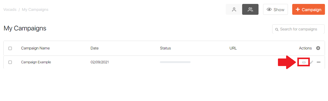
You can also view campaigns’ reports straight from the “My Campaigns” page by clicking on the “See Details” icon.
Inside the reports page
Report pages are split into different sections. The top portion shows you information about the whole campaign and the rest shows data associated with each element in the campaign. The campaign report carries information from each element so you can get a full grasp of how users interact with the campaign. If needed, you export all your data to a CSV file to run a deeper analysis on your side.
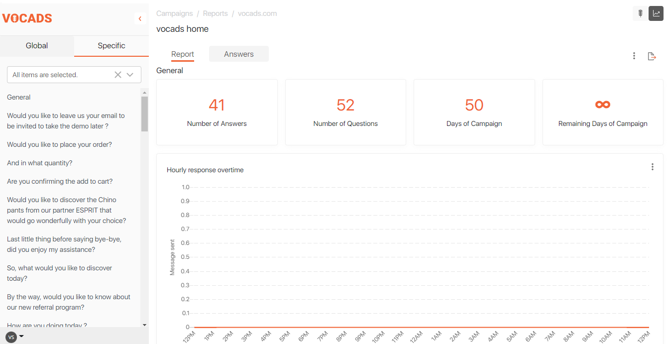
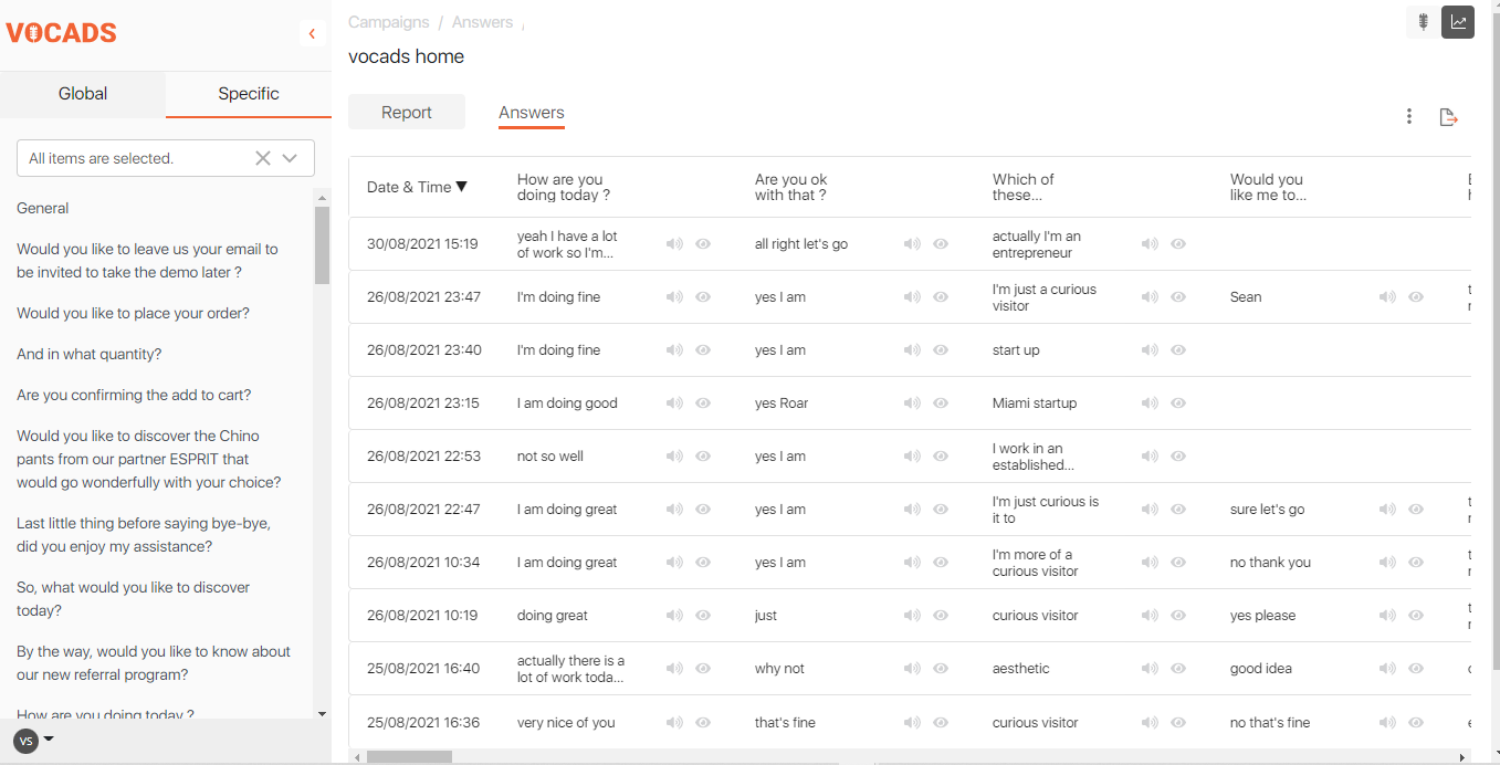
You’ll notice that all questions and prompts in the flow are displayed on the left side of the screen. Simply click on one of them to see the associated data and statistics. The visualisation changes depending on the element used in the flow, to ùake your analysis as eassy and smooth as possible.
Within the “Answers” section, you can find out and analyze the different types of responses given by the users to UNI. Clicking on it will take you to a page with detailed information about the given answers such as rimming and other details about the interaction between the user and UNI.
Report data sets
Each campaign report has different sections. Several sections provide information on the campaign as a whole or individual elements.
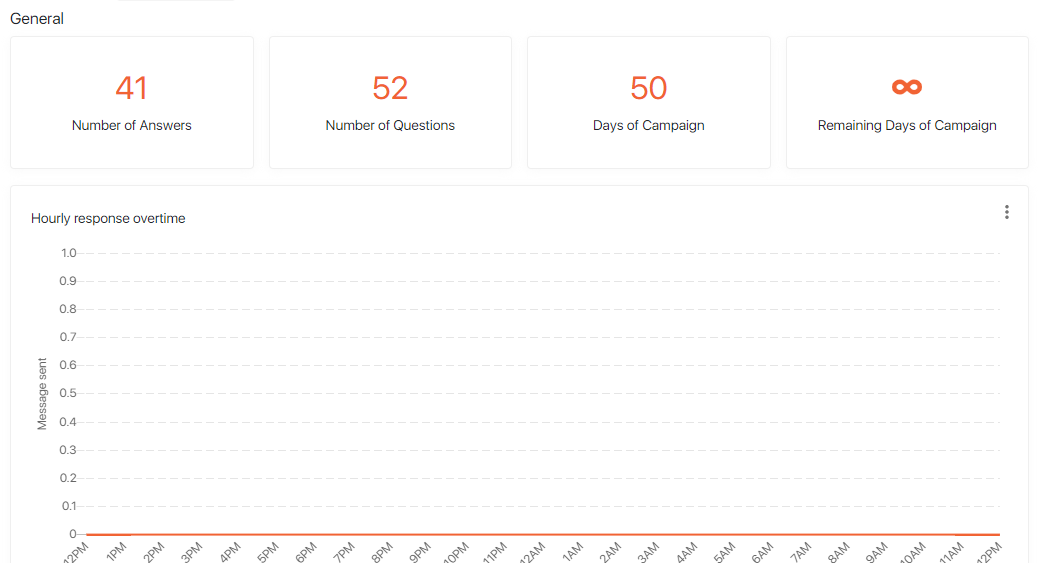
The top section displays general campaign information:
- Total number of questions;
- The total number of answers;
- days remaining until the campaign ends.
Next comes the “Hourly Response Time” plot, which shows you how many users have interacted with UNI on an hourly basis since the beginning of the campaign.
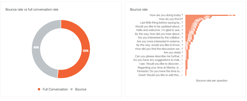
Our next chart shows the bounce rate/conversion rate of the campaign. The percentages shown here tell how many users have either left the website without completing the campaign or how many have completed it until the end. The bar chart shows you the proportion of users who reached each point in the conversational flow. We can also observe when most users stop using the voice assistance feature and/or leave the website.
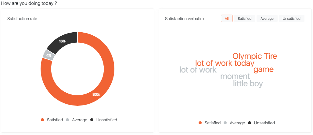
The following sections show data visualisations for each individual question and prompt in the campaign. In the previous paragraph, we mentioned how the visualisation technique depends on what kind of element is used in the campaign. For prompts or multi-choice questions, answer statistics are summarised in a pie chart and a word cloud shows you the words used the most often by users.
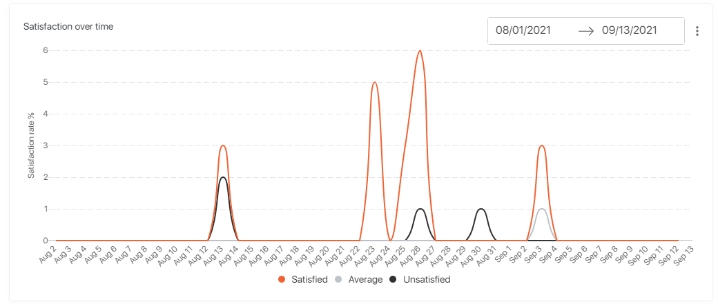
You can also visualise how the user’s answers have changed over a time period of your choice. This way, you can analyze trends and evolutions in the user’s answers and behaviour.
If you want to read a certain question, you do not have to scroll through the whole report, just click on it in the left panel and you will automatically be taken to the corresponding visualisations.
You can watch our video for a detailed description about our report panel
The Vocads campaign report allows you to understand your users and how they go down the conversational flow in great detail. Use this key information to improve your campaign, remove bottlenecks and improve your conversion rate!